How do I count thee? Let me count the ways?

How easily can you be identified on the Internet?

How easily can you be identified on the Internet? Suppose you finish your meal at a restaurant, you are about to pay the check, and t...

Wednesday, July 26, 2023

Barbie and math

      With the Barbie movie coming out, I think it's time to review Barbie and math.

      If the original Barbie doll were an actual woman, she would be 5'9" tall, have a 39-inch bust, 18-inch waist, 33-inch hips, a size 3 shoe, a weight of 110 pounds, a BMI of 16.24, and perhaps would be anorexic. (Click anorexic for the source of those measurements.) Obviously these measurements are unrealistic and send a harmful message to children. But there's a lot more to Barbie and math.

      In 1992 the infamous talking Barbie included the phrase "Math class is tough!" which was bad enough, but it was ironically misreported by the press as "Math is hard." Neither is the message we want to give to children. This immediately drew protests from the National Council of Teachers of Mathematics, the American Association of University Women, and others. Mattel removed the phrase from future dolls, and the original is now a collector's item.

      Perhaps embarrassed by this experience, subsequently Barbie put her life on the line in a high school project Barbie Bungie to help students learn algebra, physics, and statistics. This is a hands-on experiment attaching Barbie to a thick rubber band, dropping her from a height, measuring the distance of a jump and the time to descend, and then estimating the line of best fit. NCTM has a suggested lesson on this.

      But I want to spend the remainder of this article talking about Barbie and the mathematics of her facial beauty.

      The ancient Greeks discovered a particular number called the Golden Ratio, denoted by Greek letter Φ (phi), that has many interesting mathematical properties, apppears in some patterns of nature, and is considered by many to be asthetically pleasing. The Golden Ratio results from finding the point on a line segment that splits the segement into two smaller segments with lengths a and b, such that (a + b)/a = a/b.


      That ratio a/b is the Golden Ratio, Φ. With a little algebra, Φ = (1 + √5)/2 , which is an irrational number so it has an infinite non-repeating decimal, and rounded to three decimal places is 1.618.

      Renaissance artists, plastic surgeons, and makeup artists are among those who use Golden Ratios in various ways with faces to create ideally proportioned faces. Gary Meisner has wriiren extensively on the Golden Ratio, and he believes there are over 20 different ways that the Golden Ratio shows up in human faces and that “the Golden Ratio is also found very commonly in beautiful models of today across all ethnic groups. Biostatistican professor Dr. Kendra Schmid and her colleagues performed various measures of many faces. They began with 17 potential Golden Ratios, and they decided only six of these ratios were predictors of facial attractiveness. See Schmid.

      This takes us to Barbie. I attempted to measure these six ratios on a picture of Barbie (the doll, not the actress). There are many pictures of Barbie, she does enjoy experimenting with different hairstyles, and I had to find one with a hairstyle that gave me the best chance of measuring her from her hairline and also between her ears. The measurement is not exact for many reasons, and because we are using a two-dimensional photo of a three-dimensional object there is certainly some loss of accuracy. Nevertheless, here are the results:

Face length / Face Width1.07560
Mouth width / Interocular distance1.93750
Mouth width / Nose width1.97872
Lips to chin / Interocular1.54167
Lips to chin / Nose width1.574447
Ear length / Nose width1.57447
Average1.61374
% Deviation from Φ - 0.27%


      I have repeated this measurement process with celebrity faces that I think most people would consider attractive. (This is the sort of thing I would do.) Many celebrities have close phi-ratios such as Scarlett Johansson, Ryan Gosling, Brad Pitt, and Lupita Nyong'o, but none are as close to Φ as Barbie. Some celebrity faces that I think most people would consider attractive did not score well, but possibly this is due to the measurement difficulties I discussed above.

      However, I think the conclusion is clear: Barbie is an ideal beauty, using the Golden Ratio as a standard. But as they say, beauty is in the Phi of the beholder.


R Programming Notes:
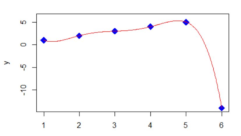
      I attempted doing the facial measurements in R. A tip of the hat to @technocrat who helped me with some of the code. With his help, I was able to read the Barbie graphic image into R and add the image onto a ggplot with coordinate axes. I then attempted to find the coordinates of the line segments corresponding to the 6 ratios and to calculate the ratios of the appropriate line segments. See the image below with the line segments. However, drawing these segments and finding the coordinates turned out to be too crude, and the results were unreliable. I include the code below as a reference for superimposing a graphic onto a ggplot. However, I redid the measurements with more precise software using Gary Meisner's software PhiMatrix , and the results in the table above are based on that software. Nevertheless, here is the R code I used:

library(ggplot2)
library(magick)
library(grid)

# Read the barbie image
barbie <- image_read("barbie.jpg")
barbie <- image_scale(barbie, "300")

# Create a data frame for the line segments
line_data <- data.frame(
x1 = c(100, 150, 140, 138, 210, 138, 150),
y1 = c(290, 355, 302, 260, 280, 260, 275),
x2 = c(210, 150, 167, 170, 210, 138, 155),
y2 = c(290, 235, 302, 260, 310, 235, 275)
)
rownames(line_data) <- c("Face_width","Face_length","Interocular", "Mouth_width", "Lips_2_chin", "Ear_length", "Nose_width" )

# Create a ggplot
p <- ggplot() +
geom_blank() +
theme_minimal() +
theme(
plot.background = element_blank(),
panel.grid = element_blank()
) +
coord_fixed(xlim = c(0, 300), ylim = c(0, 606)) +
xlab("") +
ylab("") +
scale_x_continuous(breaks = seq(0, 300, by = 50)) +
scale_y_continuous(breaks = seq(0, 606, by = 50)) +
geom_hline(yintercept = seq(0, 606, by = 50), linetype = "dotted", color = "gray") +
geom_vline(xintercept = seq(0, 300, by = 50), linetype = "dotted", color = "gray")

# Convert the barbie image to a raster object
barbie_raster <- as.raster(barbie)

# Add the barbie image to the ggplot2 plot
p <- p +
annotation_custom(
grob = rasterGrob(barbie_raster),
xmin = 0, xmax = 300,
ymin = 0, ymax = 606
)

# Add the lines to the plot
p <- p +
geom_segment(
data = line_data,
aes(x = x1, y = y1, xend = x2, yend = y2),
color = c("red", "blue", "black", "red", "navy", "black","navy"),
size = 1.5
)
# Display the plot
print(p)

rownames(line_data) <- c("Face_width","Face_length","Interocular", "Mouth_width", "Lips_2_chin", "Ear_length", "Nose_width" )

d <- vector()
d <- sqrt((line_data$x1 - line_data$x2)^2 + (line_data$y1 - line_data$y2)^2)

Face_width <- d[1]
Face_length <- d[2]
Interocular <- d[3]
Mouth_width <- d[4]
Lips_2_chin <- d[5]
Ear_length <- d[6]
Nose_width <- d[7]
r <- vector()
r[1] <- Face_length / Face_width
r[2] <- Mouth_width / Interocular
r[3] <- Mouth_width / Nose_width
r[4] <- Lips_2_chin / Interocular
r[5] <- Lips_2_chin / Nose_width
r[6] <- Ear_length / Nose_width
m <- mean(r)
phi <- (1 + sqrt(5))/2
percent_deviation <- (m - phi)/phi


Saturday, July 22, 2023

Happy Pi Approximation Day

      Many people know March 14 is celebrated as Pi Day because 3, 1, and 4 are the first three significant digits of π (using the month, day date format). I just learned that July 22 is celebrated as Pi Approximation Day (using the day/month date format) because 22/7 is a common approximation of π .

      π Is defined as the ratio of a circle’s circumference to its diameter. π Is an irrational number (it cannot be expressed as the ratio of two integers), and it has an infinite number of non-repeating digits. Approximations of π date back to ancient civilizations and continue today as people compete to calculate π to billions of decimal places on supercomputers.

      The 22/7 approximation only matches π to the second digit after the decimal place, 3.14, and 22/7 is greater than π, a fact known by Archimedes. The error in the approximation is only about 0.04%, which is close enough for most of us.

      People also compete in the number of decimal places they can recite by memory such as using mnemonic techniques with words, where the length of each word represents a digit of π . There are many creative π mnemonics , but I am content to remember the 15 word "How I need a drink, alcoholic of course, after the heavy lectures involving quantum mechanics."

      A quite impressive feat is Apu from the Simpsons who claimed to be able to recite 40,000 digits of π, and proved it by correctly stating that the 40,000th digit is 1. Apu

      The R computer language carries 15 or 16 digits. That seems like enough. A NASA engineer says he can’t think of a practical application that would require more than 15 digits of π . NASA

      π appears in many areas of math besides geometry and trigonometry. It is hidden away in statistics where the probability density function formula of the normal curve has a √(2π) term in the denominator to get the integral equal to 1, and elsewhere in other branches of math.

      Happy Pi Approximation Day.

      Here is some R code:

library(dplyr)
library(tidytext)

# compare 15 digits of 22/7 to pi
print(22/7, digits=15)
print(pi, digits=15)

# count word length & number of words in this mnemonic
textfile <- c("How I need a drink",
"alcoholic of course",
"after the heavy lectures involving quantum mechanics.")

df<-data.frame(line=1:length(textfile), text=textfile)
df_words <- df %>% unnest_tokens(word, text) %>% mutate(word_length = nchar(word))
df_words
n <- nrow(df_words)
cat("Number of words: ", n)

Friday, April 7, 2023

A more interesting pictorial numerical puzzle

I am getting tired of these little pictorial numerical puzzles with the four equations, like one where three chickens equals 60, one chicken plus two plates of two eggs per plate equals 26, and so on, until the final equation is to evaluate some mathematical expression involving chickens, eggs, and bananas.

The solution generally requires that you remember the PEMDAS (in the US, or BODMAS elsewhere) rules for order of operations especially that multiplication takes precedence over addition, and also that you carefully count the number of eggs and number of bananas. I get 36.

OK, let me try to create a more interesting pictorial puzzle.

Mathematicians agree on the PEMDAS rules, although there are many situations that PEMDAS doesn't handle. Perhaps the most common is the unary minus operator as in -32. It is unary because unlike subtraction that has two operands, the unary operator only has one. I think mathematicians would like to see the unary operator as changing the sign of the argument, so that -32 equals -9, although some software, most notably Excel, merrily calculate this as +9.

I don't believe there is a single authority for all the order of operations cases. For example, Excel, Google Search, and Wolfram Alpha do not always agree. I bet there are some pretty smart people in those companies.

Nowadays I am doing my fun calculations in the R computer language, so for the remainder of this post I will require R as the authority.

So here is my attempt at a more interesting problem, but remember, you have to use the order of operation precedence rules of R: (Let me add the link to the first item: https://www.facebook.com/watch/?v=10158293605695705 )

Do you want to try it before I reveal the R code?


The R code is:

apple <- 1
banana <- 2
kiwi <- 3
lemon <- 4
peach <- banana + lemon
pear <- banana^banana^kiwi     # 2^(2^3) = 256
pineapple <- (pear - banana) %% kiwi^2 * lemon     # (254 %% 9) * 4 = 2 * 4 = 8
strawberry <- pineapple / peach * peach     # 8; no obelus in R
kiwi <- c(lemon, pineapple, strawberry)
watermelon <- kiwi[kiwi == lemon | kiwi == pineapple & kiwi == strawberry]
# watermelon <- (lemon V pineapple ∧ strawberry)     # 4 V (8 & 8) = 4, 8

The ordering rules of R include:

  • Modular arithmetic is at the same level as multiplication:     a mod b * c is     (a mod b) *c
  • The obelus does not appear in R but is just a division symbol:     a ÷ b * c = (a / b) * c
  • Repeated exponentiation goes right to left: a ^ b ^ c = a^(b^c); lots of disagreement outside R on this one
  • Logical AND preceds logical OR

Monday, March 27, 2023

There's a black hole in the number line

The government doesn't want you to know about this, but I have discovered it and I will share this with a few close friends: There is a black hole in the number line, and it's at number 4. Every word in the English language will eventually fall into it and can't get out of it.

As an example, take the word mathematical.

Mathematical has twelve letters.
Twelve has six letters.
Six has three letters.
Three has five letters.
Five has four letters.
Four has four letters.
Four has four letters, and now we entered this black hole at 4, and we can't get out of it!

Try a few more words. Try words as long as you like. Try morphophonemically, which has 18 letters. I have done exhaustive research on this with R, and you will find every English word eventually falls into the black hole at 4 and can't get out. At this rate, there will be no words left!

Of course, this is an April Fool's Day prank.

Did you figure it out?

Here is some R code to test the word mathematical.

# Try word mathematical
library(broman)
x <- "mathematical"
y <- -99 # Initialize y
while(y != "four"){
y <- nchar(x)
y <- broman::spell_out(y, max_value = 20) # Spell out an integer as a word
print(c(x,y))
x <- y
}

Here is some R code to test ten random words.

# Try ten random words
set.seed(123)
words <- read.table("https://raw.githubusercontent.com/dwyl/english-words/master/words_alpha.txt")
original <- sample(words$V1, 10, replace = FALSE)
x <- original
rm(words) # free up memory
for (i in 1:10){
y <- vector()
y[1] <- "dummy"
for (j in 1:100){
c <- nchar(x[i])
y[j] <- spell_out(c, max_value = 20)
x[i] <- y[j]
if (y[j] == "four") {
break
}
}
cat(c(original[i], "\t", y), "\n")
}

Here is the code for the number line:

library(ggplot2)
df <- data.frame(x = c(1,2,3,4,5,6,7,8,9,10),
y = rep(0,10),
group = c("A","A","A","B","A","A","A","A","A","A"))
ggplot(df, aes(x = x, y = y)) +
geom_point(aes(color = group, size = ifelse(x == 4, 15, 15))) +
geom_hline(yintercept = 0, linetype = 1, color = "lightblue", size = 1) +
scale_x_continuous(limits = c(0, 11), expand = c(0, 0),
breaks = NULL, minor_breaks = NULL) +
scale_y_continuous(limits = c(-0.2, 0.2), expand = c(0, 0),
breaks = NULL, minor_breaks = NULL) +
scale_color_manual(values = c("red", "black")) +
ggtitle("THE BLACK HOLE AT NUMBER 4") +
theme_void() +
theme(legend.position = "none",
axis.line = element_blank(),
axis.text = element_blank(),
plot.title = element_text(color="black", size=14, face="bold")) +
geom_text(aes(x = x, y = -0.1, label = x), size = 5)

Saturday, February 25, 2023

These drinking glasses are too short!

These drinking glasses are too short!

Some of my reinsurance and math teacher friends may remember that when I am out of town and having an adult beverage with friends, I have been known to stare at the drinking glass and say something like, "I don't mean to be rude, but the glasses are certainly short here. They are much shorter than what we have back home. In fact, they are so short, that I think that the circumference of the top of the glass is larger than the height."

Then there is generally a long pause as the group considers this. The reinsurance group may require some reminder of what circumference means.

Either group (unless they have heard this before, or unless they can guess that this is a setup) will likely disagree with me. I will reply that I am pretty sure about this, and I am willing to bet a dollar.

How do you measure this in a bar or restaurant? I use a paper or cloth napkin to measure the circumference from one end of the napkin to somewhere in the middle of the napkin, and then I use that length to compare to the height.

I have done this enough times so that I am nearly always right. Try it with your own drinking glasses. The only time it consistently fails is with champagne glasses.

Recently it occurred to me that there must be a website with a wide variety of glasses and their measurements, and I found Dimensions.com, https://www.dimensions.com . Dimensions.com is a database of drawings with standard measurements. Measurements are based on industry standards and averages and may differ among manufacturers and regions. Here is a sample of glasses with their images and measurements which are used here with permission, plus my calculations in the last three columns of the table. Volumes are in ounces, heights and diameters are in centimeters. The source is https://www.dimensions.com/collection/drinking-glasses and https://www.dimensions.com/collection/wine-glasses.

Here is some R code to do the calculations and to draw the above graph. Note that pi (lower case) is an inbuilt R constant whose value is approximately 3.141593. (Yes, I am well aware that π is an infinite, non-repeating decimal, and I believe R carries 16 decimal digits, but that is beyond the scope of this article.)

df <- data.frame(glass = c("Kalina10", "Pokal22", "Chardonnay", "XL Oversized","Cordial", "Shooter", "Champagne"),
volume = c(10, 22, 12.3, 25.36, 1.5, 2, 9),
height = c(11, 17.75, 19.8, 22.9, 15.9, 10.5, 23.5),
diameter = c(8, 9.5, 7.9, 10.8, 5.1, 4.13, 6.35))
df$circumference <- round(pi * df$diameter, 1)
df$larger <- ifelse(df$circumference > df$height, "Circumference", "Height")
df$c_to_h <- round(df$circumference / df$height, 1)
df

library(ggplot2)
ggplot(df, aes(x=factor(glass, level = c("Kalina10", "Pokal22", "Chardonnay", "XL Oversize","Cordial", "Shooter", "Champagne")), y=c_to_h, fill = glass, color="black")) +
geom_col(width = 1, position = position_dodge(1)) +
geom_hline(yintercept=1) +
ggtitle("Ratio of Circumference to Height by Glass") + xlab("Glass") + ylab("Ratio") +
theme(plot.title = element_text(face="bold", size=12)) +
theme(axis.text.x = element_text(face="bold", size=12)) +
theme(axis.text.y = element_text(size=12, face="bold")) +
theme(legend.position="none") +
scale_fill_manual("glass", values=c("red", "yellow", "blue", "green", "grey", "brown", "violet"))

I think the reason this is a good bet is that the mind can not easily compare a circular length to a linear length (I don't know if that is scientifically accurate), plus perhaps we look at the diameter but we forget we are comparing the height not to the diameter, but rather to π times the diameter.

Feel free to make this bet with your friends or your students. How about sharing 10% of your winnings with me as a commission?

Incidentally, a beverage can is approximately a right circular cylinder. (But not exactly; look at the top and bottom to see why.) Calculus students can derive that the cylinder with the largest volume for a given surface area (the surface area can be thought of as the rectangular area of the paper label around the entire can), has height equal to diameter. A typical 12 ounce soda can does not have height equal to diameter, but its circumference is greater than its height. A fun supermarket experiment is to examine different shaped cans (a soup can, a tuna fish can, etc.) to determine which meet the largest volume criterion.

To my reinsurance friends: I learned the circumference greater than height trick from Paul Hawksworth of M&G.

Sunday, February 12, 2023

Some different graph types in R

I don't know about you, but I get tired of seeing column charts and pie charts. It's not difficult to create a few more interesting chart types once in a while. Whether these are relevant for a particular audience and truly display your message is a different question.

I wanted a really small dataset to experiment in R, so I used numbers of days in office for US presidents who were assassinated. Students of American history may want to pause reading this post and think about whether you can name the Presidents (and estimate the number of days), before continuing reading. Kennedy and Lincoln are most well-known, but there were others.

I decided I wanted a column chart with images on the x-axis, a wordcloud with the font size proportional to the number of days, a lolliplot chart which is a variation of a column chart but with a line instead of a bar and a dot at the end, and a donut chart which is a variation of a pie chart but where your eye focuses on the length of the arc rather than on the area of the sector.

The first chart requires images. I grabbed the images I needed (hopefully these are either old or Federal and therefore not subject to copyright prohibitions) and saved them as png files so they could be read with a readPNG from the png package.

Of course there are many more chart types that are beyond the scope of this blog post. One reference is Top 50 ggplot2 Visualizations - The Master List (With Full R Code). A very cool chart type is the radar chart which you can see at How to Create Radar Charts in R (With Examples).

Here is my output (click to enlarge) and my R code:


setwd("C:/Users/ ... ")
suppressMessages(library(dplyr))
suppressMessages(library(ggplot2))
library(png)
library(ggtext)
df <- data.frame(President = c("Lincoln", "Garfield", "McKinley", "Kennedy"), Days_in_office = c(1503,199,1654,1036) )
# column chart with images on x-axis
p <- df %>%

ggplot() +
geom_col(mapping=aes(President, y=Days_in_office, fill=President)) +
scale_fill_manual(values=c("blue", "yellow", "red", "black")) +
labs(title="Axis Labels as Images") +
theme(plot.title = element_text(hjust = .5))

garfield <- readPNG("garfield.png")
kennedy <- readPNG("kennedy.png")
lincoln <- readPNG("lincoln.png")
mckinley <- readPNG("mckinley.png")
# in the following labels statement, please replace q with <, and replace z with >

labels <- c("qimg src='garfield.png', width='35' /z","qimg src='kennedy.png', width='35' /z","qimg src='lincoln.png', width='35' /z","qimg src='mckinley.png', width='40', height='42' /z")

p <- p +
scale_x_discrete(labels = labels) +
theme(axis.text.x = ggtext::element_markdown())
p # takes a moment to draw

# ==============================================================
suppressMessages(library(wordcloud))
df %>% with(wordcloud(words=President, freq=Days_in_office, random.order=FALSE, random.color=FALSE, rot.per = 0,
colors = c("blue","black", "red")))

# =====================================================
# lolliplot plot
df %>%
ggplot() +
geom_segment(mapping=aes(x=President, xend=President, y=0, yend=Days_in_office), color=c("blue", "yellow", "red", "black") ) +
geom_point(aes(x=President, y=Days_in_office), size=4, color=c("blue", "yellow", "red", "black") ) +
ylab("Days_in_office") +
theme(axis.text = element_text(face="bold")) +
theme(text = element_text(size =16)) +
labs(title="Lolliplot Plot") +
theme(plot.title = element_text(hjust = .5))
df

# ===========================================================
# donut plot
donut <- br="" df=""> donut$fraction = donut$Days_in_office / sum(donut$Days_in_office)

# Compute the cumulative percentages (top of each rectangle)
donut$ymax = cumsum(donut$fraction)

# Compute the bottom of each rectangle
donut$ymin = c(0, head(donut$ymax, n=-1))

# Compute label position

donut$labelPosition <- 2="" br="" donut="" ymax="" ymin="">

# Create label
donut$label <- ays_in_office="" br="" donut="" n="" paste0="" resident="" value:="">

# Make the plot
ggplot(donut, aes(ymax=ymax, ymin=ymin, xmax=4, xmin=3, fill=President)) +
geom_rect() +
geom_label( x=3.5, aes(y=labelPosition, label=label), size=6) +
scale_fill_brewer(palette=4) +
coord_polar(theta="y") +
xlim(c(2, 4)) +
theme_void() +
theme(legend.position = "none") +
theme(text = element_text(size =16)) +
labs(title="Donut Plot") +
theme(plot.title = element_text(hjust = .5))

Saturday, October 29, 2022

Find the next number in the sequence

Between ages two and four, most children can count up to at least ten.

If you ask your child, "What number comes next after 1, 2, 3, 4, 5?" they will probably say "6."

But to math nerds, any number can be the next number in a finite sequence. I like -14.

Given a sequence of n real numbers f(x1), f(x2), f(x3), ... , f(xn), there is always a mathematical procedure to find the next number f(x n+1) of the sequence. The resulting solution may not appear to be satisfying to students, but it is mathematically logical.

I can draw a smooth curve through the points (1,1), (2,2), (3,3), (4,4), (5,5), (6, -14). If I can find an equation for that smooth curve, then I know my answer of -14 has some logic to it. Actually many equations will work.

In my example one equation is of the form y = (x-1)*(x-2)*(x-3)*(x-4)*(x-5)*(A/120) + x, where A is chosen so that when x is 6, the first term reduces to A, and A + 6 equals the -14 I want. So A is -20. This is called a collocation polynomial.

There is a theorem that for n+1 distinct values of xi and their corresponding yi values, there is a unique polynomial P of degree n with P(xi) = yi. One method to find P is to use polynomial regression. Another way is to use Newton's Forward Difference Formula (probably no longer taught in Numerical Analysis courses).

Higher degree polynomials than degree n is one reason why additional equations will work.

The equation does not have to be a polynomial, which then adds rational functions among others.

Of course the next number after -14 can be any number. It could be 7 :)

There are many famous sequences, and of course someone catalogued them.

Here is some R code.

xpoints <- c(1,2,3,4,5,6)
ypoints <- c(1,2,3,4,5,-14)
y <- vector()
x <- seq(from=1, to=6, by=.01)
y <- (x-1)*(x-2)*(x-3)*(x-4)*(x-5)*(-20/120) + x
plot(xpoints, ypoints, pch=18, type="p", cex=2, col="blue", xlim=c(1,6), ylim=c(-14,6), xlab="x", ylab="y")
lines(x,y, pch = 19, cex=1.3, col = "red")
fit <- lm(ypoints ~ xpoints + I(xpoints^2) + I(xpoints^3) +I(xpoints^4) +I(xpoints^5) )
s <- summary(fit)
bo <- s$coefficient[1]
b1 <- s$coefficient[2]
b2 <- s$coefficient[3]
b3 <- s$coefficient[4]
b4 <- s$coefficient[5]
b5 <- s$coefficient[6]
x <- seq(from=1, to=6, by=.01)
z <- bo+b1*x+b2*x^2+b3*x^3+b4*x^4+b5*x^5
plot(xpoints, ypoints, pch=18, type="p", cex=2, col="blue", xlim=c(1,6), ylim=c(-14,6), xlab="x", ylab="y")
lines(x,z, pch = 19, cex=1.3, col = "red")

More great R blogs at r-bloggers.com