
I wanted a really small dataset to experiment in R, so I used numbers of days in office for US presidents who were assassinated. Students
of American history may want to pause reading this post and think about whether you can name the Presidents (and estimate the number of days), before continuing reading. Kennedy and Lincoln are most well-known, but there were others.
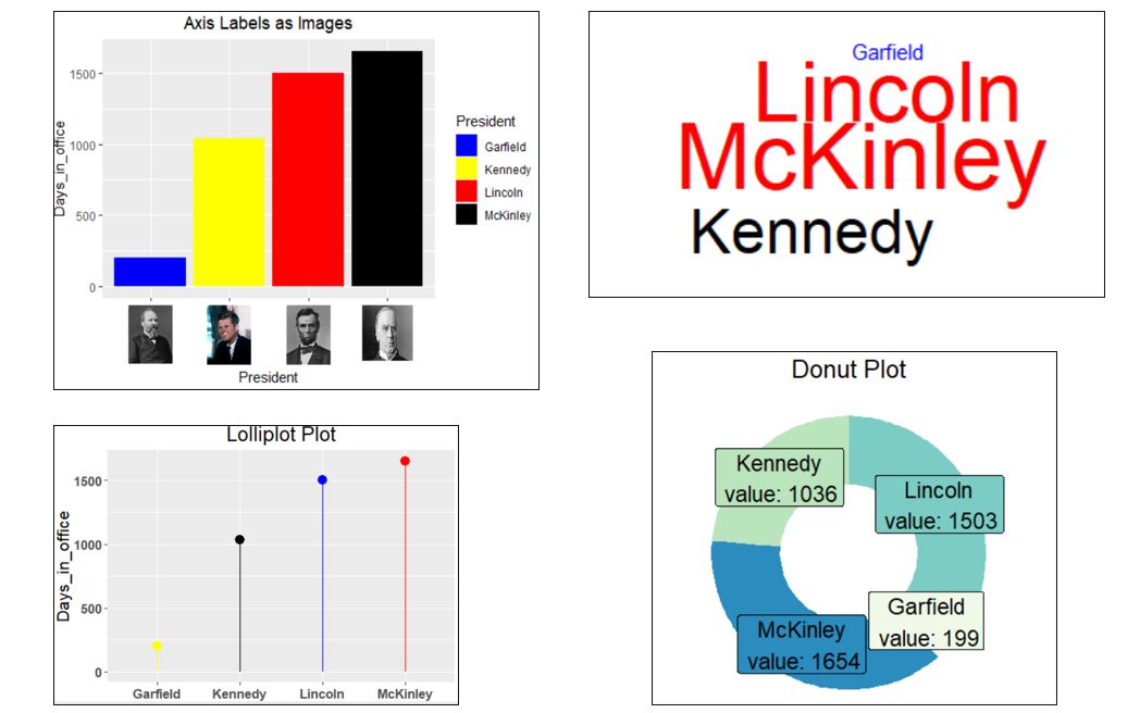
I decided I wanted a column chart with images on the x-axis, a wordcloud with the font size proportional to the number of days, a lolliplot chart which is a variation of a column chart but with a line instead of a bar and a dot at the end, and a donut chart which is a variation of a pie chart but where your eye focuses on the length of the arc rather than on the area of the sector.
The first chart requires images. I grabbed the images I needed (hopefully these are either old or Federal and therefore not subject to copyright prohibitions) and saved them as png files so they could be read with a readPNG from the png package.
Of course there are many more chart types that are beyond the scope of this blog post. One reference is Top 50 ggplot2 Visualizations - The Master List (With Full R Code). A very cool chart type is the radar chart which you can see at How to Create Radar Charts in R (With Examples).
Here is my output (click to enlarge) and my R code:
setwd("C:/Users/ ... ")
suppressMessages(library(dplyr))
suppressMessages(library(ggplot2))
library(png)
library(ggtext)
df <- data.frame(President = c("Lincoln", "Garfield", "McKinley", "Kennedy"),
Days_in_office = c(1503,199,1654,1036) )
# column chart with images on x-axis
p <- df %>%
ggplot() +
geom_col(mapping=aes(President, y=Days_in_office, fill=President)) +
scale_fill_manual(values=c("blue", "yellow", "red", "black")) +
labs(title="Axis Labels as Images") +
theme(plot.title = element_text(hjust = .5))
garfield <- readPNG("garfield.png")
kennedy <- readPNG("kennedy.png")
lincoln <- readPNG("lincoln.png")
mckinley <- readPNG("mckinley.png")
# in the following labels statement, please replace q with <, and replace z with >
labels <-
c("qimg src='garfield.png', width='35' /z","qimg src='kennedy.png', width='35' /z","qimg src='lincoln.png', width='35' /z","qimg src='mckinley.png', width='40', height='42' /z")
p <- p +
scale_x_discrete(labels = labels) +
theme(axis.text.x = ggtext::element_markdown())
p # takes a moment to draw
# ==============================================================
suppressMessages(library(wordcloud))
df %>% with(wordcloud(words=President, freq=Days_in_office, random.order=FALSE, random.color=FALSE, rot.per = 0,
colors = c("blue","black", "red")))
# =====================================================
# lolliplot plot
df %>%
ggplot() +
geom_segment(mapping=aes(x=President, xend=President, y=0, yend=Days_in_office), color=c("blue", "yellow", "red", "black") ) +
geom_point(aes(x=President, y=Days_in_office), size=4, color=c("blue", "yellow", "red", "black") ) +
ylab("Days_in_office") +
theme(axis.text = element_text(face="bold")) +
theme(text = element_text(size =16)) +
labs(title="Lolliplot Plot") +
theme(plot.title = element_text(hjust = .5))
df
# ===========================================================
# donut plot
donut <- br="" df="">
donut$fraction = donut$Days_in_office / sum(donut$Days_in_office)
# Compute the cumulative percentages (top of each rectangle)
donut$ymax = cumsum(donut$fraction)
# Compute the bottom of each rectangle
donut$ymin = c(0, head(donut$ymax, n=-1))
# Compute label position
donut$labelPosition <- 2="" br="" donut="" ymax="" ymin="">
# Create label
donut$label <- ays_in_office="" br="" donut="" n="" paste0="" resident="" value:="">
# Make the plot
ggplot(donut, aes(ymax=ymax, ymin=ymin, xmax=4, xmin=3, fill=President)) +
geom_rect() +
geom_label( x=3.5, aes(y=labelPosition, label=label), size=6) +
scale_fill_brewer(palette=4) +
coord_polar(theta="y") +
xlim(c(2, 4)) +
theme_void() +
theme(legend.position = "none") +
theme(text = element_text(size =16)) +
labs(title="Donut Plot") +
theme(plot.title = element_text(hjust = .5))
In the first labels statement
ReplyDeletelabels <-
c("qimg src='garfield.png', width='35' /z","qimg src='kennedy.png', width='35' /z","qimg src='lincoln.png', width='35' /z","qimg src='mckinley.png', width='40', height='42' /z")
please replace q with <, and replace z with >
Happily retired, the only chart I look at is my golf handicap, which is going up too fast. Maybe a logarithmic scale, and a smaller font, would diminish the ugliness of it?
ReplyDelete