How do I count thee? Let me count the ways?

How easily can you be identified on the Internet?

How easily can you be identified on the Internet? Suppose you finish your meal at a restaurant, you are about to pay the check, and t...

Wednesday, February 3, 2021

ROC for Decision Trees – where did the data come from?


      In doing decision tree classification problems, I have often graphed the ROC (Receiver Operating Characteristic) curve. The True Positive Rate (TPR) is on the y-axis, and the False Positive Rate (FPR) is on the x-axis. True Positive is when the lab test predicts you have the disease and you actually do have it. False Positive is when the lab test predicts you have the disease but you actually do not have it.
      The following code uses the sample dataset kyphosis from the rpart package, creates a default decision tree, prints the confusion matrix, and plots the ROC curve. (Kyphosis is a type of spinal deformity.)


library(rpart)
df <- kyphosis
set.seed(1)
mytree <- rpart(Kyphosis ~ Age + Number + Start, data = df, method="class")
library(rattle)
library(rpart.plot)
library(RColorBrewer)
fancyRpartPlot(mytree, uniform=TRUE, main=”Kyphosis Tree”)
predicted <- predict(mytree, type="class")
table(df$Kyphosis,predicted)
library(ROCR)
pred <- prediction(predict(mytree, type="prob")[, 2], df$Kyphosis)
plot(performance(pred, “tpr”, “fpr”), col=”blue”, main=”ROC Kyphosis, using library ROCR”)
abline(0, 1, lty=2)
auc <- performance(pred, "auc")
auc@y.values


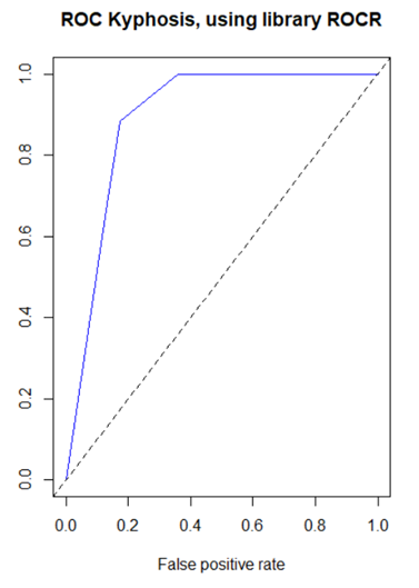
However, for a long time there has been a disconnect in my mind between the confusion matrix and the ROC curve.  The confusion matrix provides a single value of the ordered pair  (x=FPR, y=TPR) on the ROC curve, but the ROC curve has a range of values.  Where are the other values coming from?

The answer is that a default decision tree confusion matrix uses a single probability threshold value of 50%.  A decision tree ends in a set of terminal nodes.  Every observation falls in exactly one of those terminal nodes.  The predicted classification for the entire node is based on whichever classification has the greater percentage of observations, which for binary classifications requires a probability greater than 50%.  So for example if a single observation has predicted probability based on its terminal node of 58% that the disease is present, then a 50% threshold would classify this observation as disease being present.  But if the threshold were changed to 60%, then the observation would be classified as disease not being present. 

The ROC curve uses a variety of probability thresholds, reclassifies each observation, recalculates the confusion matrix, and recalculates a new value of the ordered pair (x=FPR, y=TPR) for the ROC curve.  The resulting curve shows the spread of these ordered pairs over all (including interpolated, and possibly extrapolated) probability thresholds, but the threshold values are not commonly displayed on the curve.  Plotting performance in the ROCR package does this behind the scenes, but I wanted to verify this myself.  This dataset has a small number of predictions of disease present, and at large threshold values the prediction is zero, resulting in a one column confusion matrix and zero FPR and TPR.  The following code individually applies different probability thresholds to build the ROC curve, although it does not extrapolate for large values of FPR and TPR.


dat <- data.frame()
s <- predict(mytree, type="prob")[, 2]
for (i in 1:21){
p <- .05*(i-1)
thresh <- ifelse(s>p, “present”, “absent”)
t <- table(df$Kyphosis,thresh)
fpr <- ifelse(ncol(t)==1, 0, t[1,2] / (t[1,2] + t[1,1]))
tpr <- ifelse(ncol(t)==1, 0, t[2,2] / (t[2,2] + t[2,1]))
dat[i,1] <- fpr
dat[i,2] <- tpr
}
colnames(dat) <- c("fpr", "tpr")
plot(x=dat$fpr, y=dat$tpr, xlab=”FPR”, ylab=”TPR”, xlim=c(0,1),
ylim=c(0,1),
main=”ROC Kyphosis, using indiv threshold calcs”, type=”b”, col=”blue”)
abline(0, 1, lty=2)


Monday, July 6, 2020

Outliers and Domain Knowledge

      I would like to share some thoughts about outliers and domain knowledge.
      One of the common steps during the data exploration stage is the search for outliers. Some analysis methods such as regression are very sensitive to outliers. As an example of sensitivity, in the following data (10,10) is an outlier. Including the outlier produces a regression line y = .26 + .91x, while excluding the outlier produces the very different regression line y = 2.

x <- c(1,1,1,2,2,2,3,3,3,10)
y <- c(1,2,3,1,2,3,1,2,3,10)
df <- data.frame(cbind(x,y))
lm(y ~ x, df)
plot(x,y, pch=16)
abline(lm(y ~ x, df)

      Statistics books sometimes define an outlier as being outside the range of Q1 ± 1.5*IQR or Q1 ± 3*IQR, where Q1 is the lower quartile (25th percentile value), Q3 is the upper quartile (75th percentile value), and the interquartle range IQR = Q3 – Q1.
      What does one do with an outlier? It could be bad data. It is pretty unlikely that there is a graduate student who is age 9, but we don’t know whether the value should be 19 (very rare, but possible), or 29 (likely), or 39 or more (not so rare). If we have the opportunity to ask the owner of the data, perhaps we can get the value corrected. More likely is we can not ask the owner. We can delete the entire observation, or we can pretend to correct the value with a mode or median value or a judgmental value.


      Perhaps the outlier is not bad data but rather just an unusual value. In a portfolio of property or liability insurance claims, the distribution is often positively skewed (mean greater than mode, a long tail to the positive side of the mode). Most claims are small, but occasionally there is that one enormous claim. What does one do with that outlier value? Some authors consider data science to be the Venn diagram intersection among math/statistics, computer science, and domain knowledge (see for example Drew Conway, above, in )http://drewconway.com/zia/2013/3/26/the-data-science-venn-diagram. If the data scientist is not the domain expert, he or she should consult with one. With insurance claims there are several possibilities. One is that the enormous claim is one that is unlikely to reoccur for any number of reasons. Hopefully there will never be another September 11 type destruction of two World Trade Center buildings owned by a single owner. Another example is when the insurance policy terms are revised to literally prohibit a specific kind of claim in the future. Another possibility is that the specific claim is unlikely to reoccur (the insurance company stopped insuring wheelchairs, so there won’t be another wheelchair claim), but that claim is representative of another kind of claim that is likely to occur. In this case, the outlier should not be deleted. One author has said it takes Solomon-like wisdom to discern which possibility to believe.
      An interesting example of outliers occurs with sports data. For many reasons, US major league baseball player statistics have changed over the years. There are more great home run seasons nowadays than decades ago, but there are fewer great batting average seasons. Baseball fanatics know the last .400 hitter (40% ratio of hits divided by at bats over the entire season) was Ted Williams in 1941. If we have 80 years of baseball data and we are predicting the probability of another .400 hitter, we would predict close to zero. It’s possible, but extremely unlikely, right? Actually no. Assuming there will still be a shortened season in 2020, a decision that may change, this author is willing to forecast that there will be a .400 hitter in a shortened season. This is due to the theory that batters need less time in spring training practice to be at full ability than pitchers, and it is easier to achieve .400 in a small number of at bats earlier in the season when the pitchers are not at full ability. This is another example of domain expertise as a lifetime baseball fan.

Tuesday, April 21, 2020

“Those who can, do; those who can’t – use computer simulation.”

          “Those who can, do; those who can’t – use computer simulation.” This quote was inspired by playwright George Bernard Shaw. Computer simulation is a powerful tool that attempts to reproduce the behavior of some real-world system by sampling from one or more probability distributions. It can help explain and illustrate difficult concepts such as the Monty Hall game show problem. It can also solve problems that are hard or impossible to solve directly.

          One example of a problem of this latter type is the probability distribution of the sum of n independent random variables each having probability distribution g, where n is also a random variable having probability distribution f. This is a special case of a statistical subject called convolutions, where one calculates the convolution of all possible values of the individual distributions. For certain choices of f and g, such as Poisson for f and gamma for g, the resulting convolution is an integrateable function and there is no need for simulation. But for many choices of f and g, simulation or some other numerical method is needed.

          A real-world use of this type of simulation is in modeling loss events of a business entity such as a bank or insurance company. The entity will have some random number of events n per year of random sizes that is modeled by a frequency distribution f such as Poisson or negative binomial. A number n is randomly selected from the frequency distribution. Then n random numbers are randomly selected from a severity distribution g such as lognormal or gamma to simulate the sizes of the n loss events. The n loss amounts are added to produce a total value of losses for one year. The process is repeated some large number of times, say 10,000, and the 10,000 numbers are ranked. If the entity is interested in the 99.9th percentile such loss, that value is the 9,990th largest value.

          Base R provides functions to simulate from many probability distributions. For example, rpois(n, lamda) produces n Poisson distributed samples from a distribution having population mean lambda. Poisson is a single parameter distribution with variance equal to the mean. An alternative frequency distribution with a more flexible option for the variance is the negative binomial distribution. Its R function is rnbinom(n, mu, size) which produces n negative binomial distributed samples from a distribution having population mean mu and dispersion parameter size, where size = mu^2 / (variance – mu).

          Most severity distributions are not symmetrical but rather are positively skewed with low mean and long positive tail. A random variable is lognormally distributed if the logarithm of the random variable is normally distributed. Its R function is rlnorm(n, meanlog, sdlog) which produces n lognormally distributed samples from a distribution having population mean m and standard deviation s, and here meanlog = LN(m) – .5*LN((s/m)^2 + 1)) and sdlog = .5*LN((s/m)^2+1)).

          It is helpful to plot the resulting histogram of the 10,000 simulations. The real-world purpose of the exercise may be to identify the 99.9th percentile value. The R quantile function quantile(x, probs) returns the percentile value equal to probs. To display the percentile value on a plot, use the text and arrow functions. R has a text function that adds text a plot, text(x, y, label), which adds a label at coordinate (x,y). Further, R has an arrows function, arrows(x0, y0, x1, y1, code=2), which draws an arrow from (x0, y0) to (x1, y1) with code 2 drawing the arrowhead at (x1, y1).

          The following is the R code and resulting histogram plot of a negative binomial frequency and lognormal severity simulation. The user input values are based on the mean and standard deviation values of a dataset.

# Monte Carlo simulation. Negative binomial frequency, lognormal severity.
# negbinom
nb_m <- 50 # This is a user input.
nb_sd <- 10 # This is a user input.
nb_var <- nb_sd^2
nb_size <- nb_m^2/(nb_var – nb_m)
# lognorm
xbar <- 60 # This is a user input.
sd <- 40 # This is a user input.
l_mean <- log(xbar) – .5*log((sd/xbar)^2 + 1)
l_sd <- sqrt(log((sd/xbar)^2 + 1))
num_sims <- 10000 # This is a user input.
set.seed(1234) # This is a user input.
rtotal <- vector()
for (i in 1:num_sims)
{
nb_random <- rnbinom(n=1, mu=nb_m, size=nb_size)
l_random <- rlnorm(nb_random, meanlog=l_mean, sdlog=l_sd)
rtotal[i] <- sum(l_random)
rtotal <- sort(rtotal)
m <- round(mean(rtotal), digits=0)
percentile_999 <- round(quantile(rtotal, probs=.999), digits=0)
print(paste(“Mean = “, m, ” 99.9th percentile = “, percentile_999))
hist(rtotal, breaks=20, col=”red”, xlab=”Annual Loss”, ylab=”Frequency”,
main=”Monte Carlo Simulation”)
text(percentile_999, 100, “99.9th Percentile”)
arrows(percentile_999,75, percentile_999,0, code=2)

8 Crayola Crayons

Many of my friends know I am color-challenged. Not colorblind; I see some colors, just not as many as most people see. I don't recall always being this way. In my earliest elementary school years I had a box of 8 Crayola crayons, and I did just fine. My problems began when Crayola started adding more and more colors including combinations like green yellow and yellow green. With nothing better to do, I just wrote a little program in R, and here are the original eight colors, which I still identify just fine. There is no meaning to the heights of the bars.

title <- c("Original 8 Crayola Crayons")
subtitle <- c("According to https://en.wikipedia.org/wiki/History_of_Crayola_crayons")
temp <- c(5,7,6,4,8,5,2,5) # meaningless
colors <- c("red", "yellow", "blue", "green", "orange", "brown", "violet", "black")
hex <- c("#FF0000", "#FFFF00", "#0000FF", "#008001", "#FF6600", "#964B00", "#6A0DAD", "#000000")
barplot(temp, col=hex, main=title, sub=subtitle, names.arg=colors)

Wednesday, July 4, 2018

Math in the news
Every July 1 there will be something in the news on the New York Mets paying retired baseball player Bobby Bonilla $1.19 million per year, even though he last played for the Mets in 1999.

The Mets released him in 1999, but they still owed him $5.9 million in 2000 for the last year of a 5-year contract. The Mets and his agent negotiated a deal where the Mets would pay him 25 deferred payments of $1,193,248 per year starting in 2011 and ending in 2035. This was calculated at an 8% interest rate. The Mets were willing to do this because they thought they were earning 12% to 15% on investments with Bernie Madoff which turned out to be fictional.

From Bonilla’s viewpoint these 25 payments of $1,193,248 per year, deferred 10 years from 2001, has a present value equal to the $5.9 million he otherwise was due: (1/1.08^10) * 1193248 * (1 - 1.08^-25)/.08 equals 5.9 million, so at 8% interest this was a fair deal for him. At today’s low interest rates, 8% looks pretty high. From the Mets’ viewpoint, even if they only earned 10%, the present value is $4.2 million, which is lower than the $5.9 million they originally owed him. Of course the Mets did not earn 10% on their Madoff investment.

These formulas appear in many math and finance textbooks under the subject of math and finance. Accountants were no doubt involved in the negotiations. I just want to suggest that math and accounting are sometimes in the news.

Tuesday, July 25, 2017

Hi.

A high school Social Studies teacher may have a degree in History, but may be called upon to teach Economics, Business Law, Personal Finance, Sociology, Psychology, Criminal Science, or whatever subjects fall under Social Science, despite having little or zero background in that subject. We just assume the teacher will learn what he or she needs.

A high school or college Math teacher may have a degree in Math, but that doesn't mean he or she has taken every possible Math course. College Geometry? Finite Math? Statistics? Cryptography? A Math teacher may be called upon to teach one of these, despite having little or zero background in that subject. We just assume the teacher will learn what he or she needs.

So when a small college puts Accounting in its Math department, and decides that Accounting will fulfill a student's Math requirement, is it so surprising that the college will ask a Math teacher to teach Accounting? They did, and I am.

I did take a semester of college Accounting, decades ago. I have worked in my non-academic career with accountants. And trust me, Accounting 1 is not rocket science. So I am teaching Accounting.

The part that bothers me is that unlike the claim I make when I teach Math, I do not have a passion for Accounting.

Any comments? Would you agree to teach Accounting?

Monday, January 2, 2017

Math is hard.  Although so is putting on eyeliner - not that I've done a lot of that.


Hi.  Something not discussed in my various teacher trainings is normalizing the difficulty of an exam.  In teaching a course for the first time, I borrow another teacher's exams, and then I try to create mine that seem about equal in difficulty.  But how difficult is my exam, and is it the appropriate level of difficulty?  For a gen ed community college math course, I sort of think the very best student should get close to 100, and the class average ought to be about 75.  Of course this assumes students attend nearly every class, pay attention in class, take notes in class, do the assigned homework, etc.; assumptions that have not been exactly true in my classes.  Maybe this also assumes I am a decent teacher.  I have been curving my exams about 15 points to account for the fact that maybe my exams were too hard, and I was perhaps not the most effective teacher. Hopefully I will improve my exam creation with experience and curve less in the future.