How do I count thee? Let me count the ways?

How easily can you be identified on the Internet?

How easily can you be identified on the Internet? Suppose you finish your meal at a restaurant, you are about to pay the check, and t...

Saturday, February 25, 2023

These drinking glasses are too short!

These drinking glasses are too short!

Some of my reinsurance and math teacher friends may remember that when I am out of town and having an adult beverage with friends, I have been known to stare at the drinking glass and say something like, "I don't mean to be rude, but the glasses are certainly short here. They are much shorter than what we have back home. In fact, they are so short, that I think that the circumference of the top of the glass is larger than the height."

Then there is generally a long pause as the group considers this. The reinsurance group may require some reminder of what circumference means.

Either group (unless they have heard this before, or unless they can guess that this is a setup) will likely disagree with me. I will reply that I am pretty sure about this, and I am willing to bet a dollar.

How do you measure this in a bar or restaurant? I use a paper or cloth napkin to measure the circumference from one end of the napkin to somewhere in the middle of the napkin, and then I use that length to compare to the height.

I have done this enough times so that I am nearly always right. Try it with your own drinking glasses. The only time it consistently fails is with champagne glasses.

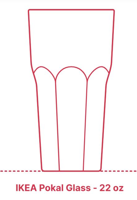
Recently it occurred to me that there must be a website with a wide variety of glasses and their measurements, and I found Dimensions.com, https://www.dimensions.com . Dimensions.com is a database of drawings with standard measurements. Measurements are based on industry standards and averages and may differ among manufacturers and regions. Here is a sample of glasses with their images and measurements which are used here with permission, plus my calculations in the last three columns of the table. Volumes are in ounces, heights and diameters are in centimeters. The source is https://www.dimensions.com/collection/drinking-glasses and https://www.dimensions.com/collection/wine-glasses.

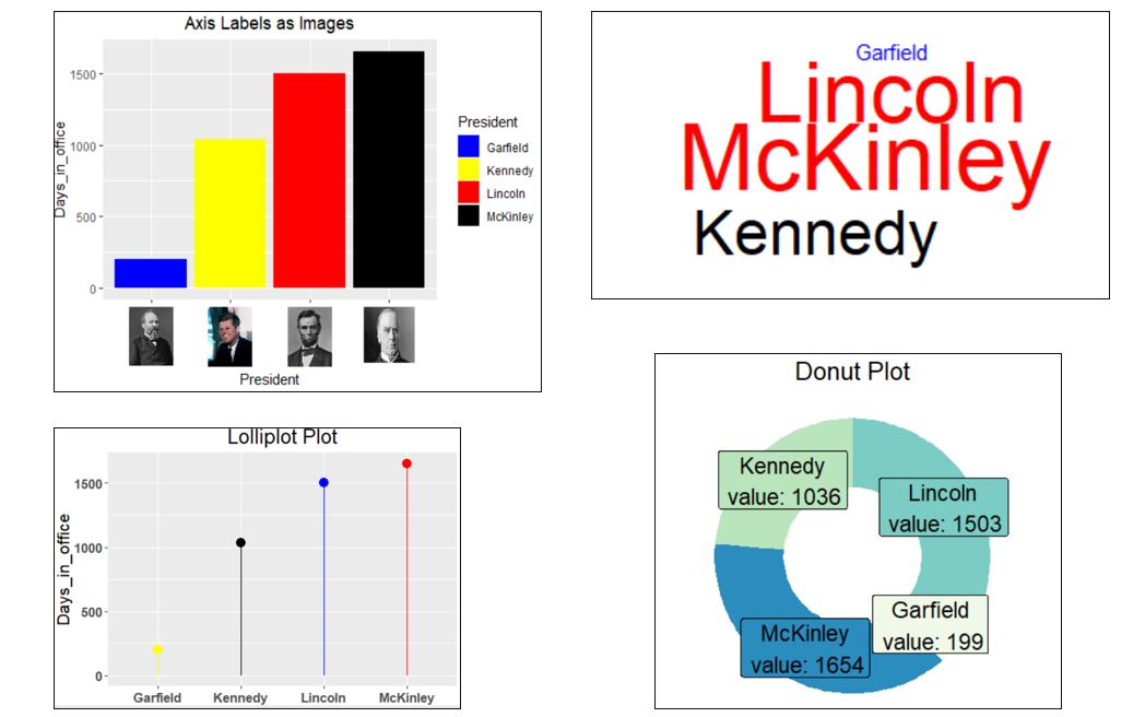
Here is some R code to do the calculations and to draw the above graph. Note that pi (lower case) is an inbuilt R constant whose value is approximately 3.141593. (Yes, I am well aware that π is an infinite, non-repeating decimal, and I believe R carries 16 decimal digits, but that is beyond the scope of this article.)

df <- data.frame(glass = c("Kalina10", "Pokal22", "Chardonnay", "XL Oversized","Cordial", "Shooter", "Champagne"),
volume = c(10, 22, 12.3, 25.36, 1.5, 2, 9),
height = c(11, 17.75, 19.8, 22.9, 15.9, 10.5, 23.5),
diameter = c(8, 9.5, 7.9, 10.8, 5.1, 4.13, 6.35))
df$circumference <- round(pi * df$diameter, 1)
df$larger <- ifelse(df$circumference > df$height, "Circumference", "Height")
df$c_to_h <- round(df$circumference / df$height, 1)
df

library(ggplot2)
ggplot(df, aes(x=factor(glass, level = c("Kalina10", "Pokal22", "Chardonnay", "XL Oversize","Cordial", "Shooter", "Champagne")), y=c_to_h, fill = glass, color="black")) +
geom_col(width = 1, position = position_dodge(1)) +
geom_hline(yintercept=1) +
ggtitle("Ratio of Circumference to Height by Glass") + xlab("Glass") + ylab("Ratio") +
theme(plot.title = element_text(face="bold", size=12)) +
theme(axis.text.x = element_text(face="bold", size=12)) +
theme(axis.text.y = element_text(size=12, face="bold")) +
theme(legend.position="none") +
scale_fill_manual("glass", values=c("red", "yellow", "blue", "green", "grey", "brown", "violet"))

I think the reason this is a good bet is that the mind can not easily compare a circular length to a linear length (I don't know if that is scientifically accurate), plus perhaps we look at the diameter but we forget we are comparing the height not to the diameter, but rather to π times the diameter.

Feel free to make this bet with your friends or your students. How about sharing 10% of your winnings with me as a commission?

Incidentally, a beverage can is approximately a right circular cylinder. (But not exactly; look at the top and bottom to see why.) Calculus students can derive that the cylinder with the largest volume for a given surface area (the surface area can be thought of as the rectangular area of the paper label around the entire can), has height equal to diameter. A typical 12 ounce soda can does not have height equal to diameter, but its circumference is greater than its height. A fun supermarket experiment is to examine different shaped cans (a soup can, a tuna fish can, etc.) to determine which meet the largest volume criterion.

To my reinsurance friends: I learned the circumference greater than height trick from Paul Hawksworth of M&G.

Sunday, February 12, 2023

Some different graph types in R

I don't know about you, but I get tired of seeing column charts and pie charts. It's not difficult to create a few more interesting chart types once in a while. Whether these are relevant for a particular audience and truly display your message is a different question.

I wanted a really small dataset to experiment in R, so I used numbers of days in office for US presidents who were assassinated. Students of American history may want to pause reading this post and think about whether you can name the Presidents (and estimate the number of days), before continuing reading. Kennedy and Lincoln are most well-known, but there were others.

I decided I wanted a column chart with images on the x-axis, a wordcloud with the font size proportional to the number of days, a lolliplot chart which is a variation of a column chart but with a line instead of a bar and a dot at the end, and a donut chart which is a variation of a pie chart but where your eye focuses on the length of the arc rather than on the area of the sector.

The first chart requires images. I grabbed the images I needed (hopefully these are either old or Federal and therefore not subject to copyright prohibitions) and saved them as png files so they could be read with a readPNG from the png package.

Of course there are many more chart types that are beyond the scope of this blog post. One reference is Top 50 ggplot2 Visualizations - The Master List (With Full R Code). A very cool chart type is the radar chart which you can see at How to Create Radar Charts in R (With Examples).

Here is my output (click to enlarge) and my R code:


setwd("C:/Users/ ... ")
suppressMessages(library(dplyr))
suppressMessages(library(ggplot2))
library(png)
library(ggtext)
df <- data.frame(President = c("Lincoln", "Garfield", "McKinley", "Kennedy"), Days_in_office = c(1503,199,1654,1036) )
# column chart with images on x-axis
p <- df %>%

ggplot() +
geom_col(mapping=aes(President, y=Days_in_office, fill=President)) +
scale_fill_manual(values=c("blue", "yellow", "red", "black")) +
labs(title="Axis Labels as Images") +
theme(plot.title = element_text(hjust = .5))

garfield <- readPNG("garfield.png")
kennedy <- readPNG("kennedy.png")
lincoln <- readPNG("lincoln.png")
mckinley <- readPNG("mckinley.png")
# in the following labels statement, please replace q with <, and replace z with >

labels <- c("qimg src='garfield.png', width='35' /z","qimg src='kennedy.png', width='35' /z","qimg src='lincoln.png', width='35' /z","qimg src='mckinley.png', width='40', height='42' /z")

p <- p +
scale_x_discrete(labels = labels) +
theme(axis.text.x = ggtext::element_markdown())
p # takes a moment to draw

# ==============================================================
suppressMessages(library(wordcloud))
df %>% with(wordcloud(words=President, freq=Days_in_office, random.order=FALSE, random.color=FALSE, rot.per = 0,
colors = c("blue","black", "red")))

# =====================================================
# lolliplot plot
df %>%
ggplot() +
geom_segment(mapping=aes(x=President, xend=President, y=0, yend=Days_in_office), color=c("blue", "yellow", "red", "black") ) +
geom_point(aes(x=President, y=Days_in_office), size=4, color=c("blue", "yellow", "red", "black") ) +
ylab("Days_in_office") +
theme(axis.text = element_text(face="bold")) +
theme(text = element_text(size =16)) +
labs(title="Lolliplot Plot") +
theme(plot.title = element_text(hjust = .5))
df

# ===========================================================
# donut plot
donut <- br="" df=""> donut$fraction = donut$Days_in_office / sum(donut$Days_in_office)

# Compute the cumulative percentages (top of each rectangle)
donut$ymax = cumsum(donut$fraction)

# Compute the bottom of each rectangle
donut$ymin = c(0, head(donut$ymax, n=-1))

# Compute label position

donut$labelPosition <- 2="" br="" donut="" ymax="" ymin="">

# Create label
donut$label <- ays_in_office="" br="" donut="" n="" paste0="" resident="" value:="">

# Make the plot
ggplot(donut, aes(ymax=ymax, ymin=ymin, xmax=4, xmin=3, fill=President)) +
geom_rect() +
geom_label( x=3.5, aes(y=labelPosition, label=label), size=6) +
scale_fill_brewer(palette=4) +
coord_polar(theta="y") +
xlim(c(2, 4)) +
theme_void() +
theme(legend.position = "none") +
theme(text = element_text(size =16)) +
labs(title="Donut Plot") +
theme(plot.title = element_text(hjust = .5))

Saturday, October 29, 2022

Find the next number in the sequence

Between ages two and four, most children can count up to at least ten.

If you ask your child, "What number comes next after 1, 2, 3, 4, 5?" they will probably say "6."

But to math nerds, any number can be the next number in a finite sequence. I like -14.

Given a sequence of n real numbers f(x1), f(x2), f(x3), ... , f(xn), there is always a mathematical procedure to find the next number f(x n+1) of the sequence. The resulting solution may not appear to be satisfying to students, but it is mathematically logical.

I can draw a smooth curve through the points (1,1), (2,2), (3,3), (4,4), (5,5), (6, -14). If I can find an equation for that smooth curve, then I know my answer of -14 has some logic to it. Actually many equations will work.

In my example one equation is of the form y = (x-1)*(x-2)*(x-3)*(x-4)*(x-5)*(A/120) + x, where A is chosen so that when x is 6, the first term reduces to A, and A + 6 equals the -14 I want. So A is -20. This is called a collocation polynomial.

There is a theorem that for n+1 distinct values of xi and their corresponding yi values, there is a unique polynomial P of degree n with P(xi) = yi. One method to find P is to use polynomial regression. Another way is to use Newton's Forward Difference Formula (probably no longer taught in Numerical Analysis courses).

Higher degree polynomials than degree n is one reason why additional equations will work.

The equation does not have to be a polynomial, which then adds rational functions among others.

Of course the next number after -14 can be any number. It could be 7 :)

There are many famous sequences, and of course someone catalogued them.

Here is some R code.

xpoints <- c(1,2,3,4,5,6)
ypoints <- c(1,2,3,4,5,-14)
y <- vector()
x <- seq(from=1, to=6, by=.01)
y <- (x-1)*(x-2)*(x-3)*(x-4)*(x-5)*(-20/120) + x
plot(xpoints, ypoints, pch=18, type="p", cex=2, col="blue", xlim=c(1,6), ylim=c(-14,6), xlab="x", ylab="y")
lines(x,y, pch = 19, cex=1.3, col = "red")
fit <- lm(ypoints ~ xpoints + I(xpoints^2) + I(xpoints^3) +I(xpoints^4) +I(xpoints^5) )
s <- summary(fit)
bo <- s$coefficient[1]
b1 <- s$coefficient[2]
b2 <- s$coefficient[3]
b3 <- s$coefficient[4]
b4 <- s$coefficient[5]
b5 <- s$coefficient[6]
x <- seq(from=1, to=6, by=.01)
z <- bo+b1*x+b2*x^2+b3*x^3+b4*x^4+b5*x^5
plot(xpoints, ypoints, pch=18, type="p", cex=2, col="blue", xlim=c(1,6), ylim=c(-14,6), xlab="x", ylab="y")
lines(x,z, pch = 19, cex=1.3, col = "red")

More great R blogs at r-bloggers.com

Saturday, September 17, 2022

How do I count thee? Let me count the ways?

by Jerry Tuttle   

In Major League Baseball, a player who hits 50 home runs in a single season has hit a lot of home runs. Suppose I want to count the number of 50 homer seasons by team, and also the number of 50 homer seasons by New York Yankees. (I will count Maris and Mantle in 1961 as two.) Here is the data including Aaron Judge's 62 in 2022 :

You would think base R would have a count function such as count(df$Team) and count(df$Team == "NYY") but this gives the error "could not find function 'count'". Base R does not have a count function.

Base R has at last four ways to perform a count:

1. The table function will count items in a vector.    table(df$Team) presents results horizontally, and data.frame(table(df$Team)) presents results vertically.    table(df$Team == "NYY") displays results 37 false and 10 true, while table(df$Team == "NYY")[2] just displays the result 10 true.

2. The sum function can be used to count the number of rows meeting a condition.    sum(df$Team == "NYY") displays the result 10. Here df$Team == "NYY" is creating a logical vector, and sum is summing the number of true = 1.

3. Similar to sum, nrow(df[df$Team == "NYY", ]) counts the number of rows meeting the NYY condition.

4. The length function counts the number of elements in an R object.    length(which(df$Team == "NYY")) , length(df$Team[df$Team == "NYY"]) , and length(grep("NYY", df[ , "Team"])) are all ways that will count the 10 Yankees.

The more direct solution to counting uses the count function in the dplyr library. Note that dplyr's count function applies to a data frame or tibble, but not to a vector. After loading library(dplyr) ,

1. df %>% count(Team) lists the count for each team.

2. df %>% filter(Team = "NYY") lists each Yankee, and you can see there are 10.

3. df %>% count(Team == "NYY") displays 37 false and 10 true, while df %>% filter(Team == "NYY") %>% count() just displays the 10 true.

The following is a bar chart of the results by team for teams with at least 1 50 homer season:

Finally, "How do I count thee? Let me count the ways?" is of course adapted from Elizabeth Barrett Browning's poem "How do I love thee? Let me count the ways?" But in her poem, just how would we count the number of times "love" is mentioned? The tidytext library makes counting words fairly easy, and the answer is ten, the same number of 50 homer Yankee seasons. Coincidence?

The following is all the R code. Happy counting!

library(dplyr)
library(ggplot2)
library(tidytext)

df <- data.frame(
   Player=c('Ruth','Ruth','Ruth','Ruth','Wilson','Foxx','Greenberg','Foxx','Kiner','Mize','Kiner','Mays','Mantle','Maris', 'Mantle','Mays','Foster','Fielder','Belle','McGwire','Anderson','McGwire','Griffey','McGwire','Sosa','Griffey', 'Vaughn','McGwire','Sosa','Sosa','Bonds','Sosa','Gonzalez','Rodriguez','Rodriguez','Thome','Jones','Howard','Ortiz', 'Rodriguez','Fielder','Bautista','Davis','Stanton','Judge','Alonso','Judge'),
   Year=c(1920,1921,1927,1928,1930,1932,1938,1938,1947,1947,1949,1955,1956,1961,1961,1965,1977,1990,1995,1996,1996,1997,1997, 1998,1998,1998,1998,1999,1999,2000,2001,2001,2001,2001,2002,2002,2005,2006,2006,2007,2007,2010,2013,2017,2017,2019,2022),
   Homers=c(54,59,60,54,56,58,58,50,51,51,54,51,52,61,54,52,52,51,50,52,50,58,56,70,66,56,50,65,63,50,73,64,57,52,57,52,51, 58,54,54,50,54,53,59,52,53,62),
   Team=c('NYY','NYY','NYY','NYY','CHC','PHA','DET','BOS','PIT','NYG','PIT','NYG','NYY','NYY','NYY','SF','CIN','DET','CLE', 'OAK','BAL','OAK/SLC','SEA','SLC','CHC','SEA','SD','SLC','CHC','CHC','SF','CHC','ARI','TEX','TEX','CLE','ATL','PHP', 'BOR','NYY','MIL','TOR','BAL','MIA','NYY','NYM','NYY'))

head(df)

# base R ways to count:

table(df$Team)    # shows results horizontally
data.frame(table(df$Team))    #shows results vertically
table(df$Team == "NYY")    # displays 37 false and 10 true
table(df$Team == "NYY")[2]

sum(df$Team == "NYY")    # displays the result 10.

nrow(df[df$Team == "NYY", ])    # counts the number of rows meeting the NYY condition.

length(which(df$Team == "NYY"))     # which returns a vector of indices which are true
length(df$Team[df$Team == "NYY"])
length(grep("NYY", df[ , "Team"]))     # grep returns a vector of indices that match the pattern

# dplyr R ways to count; remember to load library(dplyr):

df %>% count(Team)    # lists the count for each team.

df %>% filter(Team == "NYY")    # lists each Yankee, and you can see there are 10.

df %>% count(Team == "NYY")    # displays 37 false and 10 true, while
df %>% filter(Team == "NYY") %>% count()    # just displays the 10 true.

# barplot of all teams with at least 1 50 homer season; remember to load library(ggplot2)

df %>%
    group_by(Team) %>%
    summarise(count = n()) %>%
    ggplot(aes(x=reorder(Team, count), y=count, fill=Team)) +
    geom_bar(stat = 'identity') +
    ggtitle("Count of 50 Homer Seasons") +
    xlab("Team") +
    scale_y_continuous(breaks=c(1,2,3,4,5,6,7,8,9,10)) +
    coord_flip() +
    theme(plot.title = element_text(face="bold", size=18)) +
    theme(axis.title.y = element_text(face="bold")) +
    theme(axis.title.x = element_blank()) +
    theme(axis.text.x = element_text(size=12, face="bold"),
    axis.text.y = element_text(size=12, face="bold")) +
    theme(legend.position="none")

# count number of times "love" is mentioned in Browning's poem; remember to load library(tidytext)

textfile <- c("How do I love thee? Let me count the ways.",
"I love thee to the depth and breadth and height",
"My soul can reach, when feeling out of sight",
"For the ends of being and ideal grace.",
"I love thee to the level of every day's",
"Most quiet need, by sun and candle-light.",
"I love thee freely, as men strive for right.",
"I love thee purely, as they turn from praise.",
"I love thee with the passion put to use",
"In my old griefs, and with my childhood's faith.",
"I love thee with a love I seemed to lose",
"With my lost saints. I love thee with the breath,",
"Smiles, tears, of all my life; and, if God choose,",
"I shall but love thee better after death.")

df<-data.frame(line=1:length(textfile), text=textfile)
df_words <- df %>% unnest_tokens(word, text)
cleaned_words <- df_words %>% anti_join(get_stopwords())
cleaned_words %>% count(word, sort = TRUE) %>% head(6)
cleaned_words %>% filter(word == "love") %>% count()

More great R blogs at r-bloggers.com

Wednesday, June 22, 2022

What is the difference between statistics and data analysis?

What is the difference between statistics and data analysis?

Of course to answer this we need to define those terms, and definitions of such things are hardly standard. But they are nor particularly standard in other disciplines either. Can you define art? Music? How about mathematics?

Would you have defined mathematics as "including such topics as numbers, formulas and related structures, shapes and the spaces in which they are contained, and quantities and their changes," as in Wikipedia? Is this all-encompassing?

Statistics and data analysis have some overlaps. Both involve defining, exploring, cleaning, visualizing, and describing data. Data analyst students study some traditional statistics. Statistics students nowadays study some data analysis.

The father and daughter Larose team have suggested a working distinction of inferential statistics versus data mining (so neither of these is identical to the terms in the first sentence above) as follows:

Inferential statistics involves having a prior hypothesis about a population and testing that hypothesis with a sample from that population. The test may result in statistical significance, even if there is no practical significance.

Data mining does not begin with a prior hypothesis, but rather the analyst "freely trolls through the data for actionable results." (Larose, p. 161)

Larose, D.T. & Larose, C.D. (2015). Data mining and predictive analytics. Wiley. Hoboken, NJ.

Wednesday, February 3, 2021

ROC for Decision Trees – where did the data come from?


      In doing decision tree classification problems, I have often graphed the ROC (Receiver Operating Characteristic) curve. The True Positive Rate (TPR) is on the y-axis, and the False Positive Rate (FPR) is on the x-axis. True Positive is when the lab test predicts you have the disease and you actually do have it. False Positive is when the lab test predicts you have the disease but you actually do not have it.
      The following code uses the sample dataset kyphosis from the rpart package, creates a default decision tree, prints the confusion matrix, and plots the ROC curve. (Kyphosis is a type of spinal deformity.)


library(rpart)
df <- kyphosis
set.seed(1)
mytree <- rpart(Kyphosis ~ Age + Number + Start, data = df, method="class")
library(rattle)
library(rpart.plot)
library(RColorBrewer)
fancyRpartPlot(mytree, uniform=TRUE, main=”Kyphosis Tree”)
predicted <- predict(mytree, type="class")
table(df$Kyphosis,predicted)
library(ROCR)
pred <- prediction(predict(mytree, type="prob")[, 2], df$Kyphosis)
plot(performance(pred, “tpr”, “fpr”), col=”blue”, main=”ROC Kyphosis, using library ROCR”)
abline(0, 1, lty=2)
auc <- performance(pred, "auc")
auc@y.values


However, for a long time there has been a disconnect in my mind between the confusion matrix and the ROC curve.  The confusion matrix provides a single value of the ordered pair  (x=FPR, y=TPR) on the ROC curve, but the ROC curve has a range of values.  Where are the other values coming from?

The answer is that a default decision tree confusion matrix uses a single probability threshold value of 50%.  A decision tree ends in a set of terminal nodes.  Every observation falls in exactly one of those terminal nodes.  The predicted classification for the entire node is based on whichever classification has the greater percentage of observations, which for binary classifications requires a probability greater than 50%.  So for example if a single observation has predicted probability based on its terminal node of 58% that the disease is present, then a 50% threshold would classify this observation as disease being present.  But if the threshold were changed to 60%, then the observation would be classified as disease not being present. 

The ROC curve uses a variety of probability thresholds, reclassifies each observation, recalculates the confusion matrix, and recalculates a new value of the ordered pair (x=FPR, y=TPR) for the ROC curve.  The resulting curve shows the spread of these ordered pairs over all (including interpolated, and possibly extrapolated) probability thresholds, but the threshold values are not commonly displayed on the curve.  Plotting performance in the ROCR package does this behind the scenes, but I wanted to verify this myself.  This dataset has a small number of predictions of disease present, and at large threshold values the prediction is zero, resulting in a one column confusion matrix and zero FPR and TPR.  The following code individually applies different probability thresholds to build the ROC curve, although it does not extrapolate for large values of FPR and TPR.


dat <- data.frame()
s <- predict(mytree, type="prob")[, 2]
for (i in 1:21){
p <- .05*(i-1)
thresh <- ifelse(s>p, “present”, “absent”)
t <- table(df$Kyphosis,thresh)
fpr <- ifelse(ncol(t)==1, 0, t[1,2] / (t[1,2] + t[1,1]))
tpr <- ifelse(ncol(t)==1, 0, t[2,2] / (t[2,2] + t[2,1]))
dat[i,1] <- fpr
dat[i,2] <- tpr
}
colnames(dat) <- c("fpr", "tpr")
plot(x=dat$fpr, y=dat$tpr, xlab=”FPR”, ylab=”TPR”, xlim=c(0,1),
ylim=c(0,1),
main=”ROC Kyphosis, using indiv threshold calcs”, type=”b”, col=”blue”)
abline(0, 1, lty=2)


Monday, July 6, 2020

Outliers and Domain Knowledge

      I would like to share some thoughts about outliers and domain knowledge.
      One of the common steps during the data exploration stage is the search for outliers. Some analysis methods such as regression are very sensitive to outliers. As an example of sensitivity, in the following data (10,10) is an outlier. Including the outlier produces a regression line y = .26 + .91x, while excluding the outlier produces the very different regression line y = 2.

x <- c(1,1,1,2,2,2,3,3,3,10)
y <- c(1,2,3,1,2,3,1,2,3,10)
df <- data.frame(cbind(x,y))
lm(y ~ x, df)
plot(x,y, pch=16)
abline(lm(y ~ x, df)

      Statistics books sometimes define an outlier as being outside the range of Q1 ± 1.5*IQR or Q1 ± 3*IQR, where Q1 is the lower quartile (25th percentile value), Q3 is the upper quartile (75th percentile value), and the interquartle range IQR = Q3 – Q1.
      What does one do with an outlier? It could be bad data. It is pretty unlikely that there is a graduate student who is age 9, but we don’t know whether the value should be 19 (very rare, but possible), or 29 (likely), or 39 or more (not so rare). If we have the opportunity to ask the owner of the data, perhaps we can get the value corrected. More likely is we can not ask the owner. We can delete the entire observation, or we can pretend to correct the value with a mode or median value or a judgmental value.


      Perhaps the outlier is not bad data but rather just an unusual value. In a portfolio of property or liability insurance claims, the distribution is often positively skewed (mean greater than mode, a long tail to the positive side of the mode). Most claims are small, but occasionally there is that one enormous claim. What does one do with that outlier value? Some authors consider data science to be the Venn diagram intersection among math/statistics, computer science, and domain knowledge (see for example Drew Conway, above, in )http://drewconway.com/zia/2013/3/26/the-data-science-venn-diagram. If the data scientist is not the domain expert, he or she should consult with one. With insurance claims there are several possibilities. One is that the enormous claim is one that is unlikely to reoccur for any number of reasons. Hopefully there will never be another September 11 type destruction of two World Trade Center buildings owned by a single owner. Another example is when the insurance policy terms are revised to literally prohibit a specific kind of claim in the future. Another possibility is that the specific claim is unlikely to reoccur (the insurance company stopped insuring wheelchairs, so there won’t be another wheelchair claim), but that claim is representative of another kind of claim that is likely to occur. In this case, the outlier should not be deleted. One author has said it takes Solomon-like wisdom to discern which possibility to believe.
      An interesting example of outliers occurs with sports data. For many reasons, US major league baseball player statistics have changed over the years. There are more great home run seasons nowadays than decades ago, but there are fewer great batting average seasons. Baseball fanatics know the last .400 hitter (40% ratio of hits divided by at bats over the entire season) was Ted Williams in 1941. If we have 80 years of baseball data and we are predicting the probability of another .400 hitter, we would predict close to zero. It’s possible, but extremely unlikely, right? Actually no. Assuming there will still be a shortened season in 2020, a decision that may change, this author is willing to forecast that there will be a .400 hitter in a shortened season. This is due to the theory that batters need less time in spring training practice to be at full ability than pitchers, and it is easier to achieve .400 in a small number of at bats earlier in the season when the pitchers are not at full ability. This is another example of domain expertise as a lifetime baseball fan.